The Problem
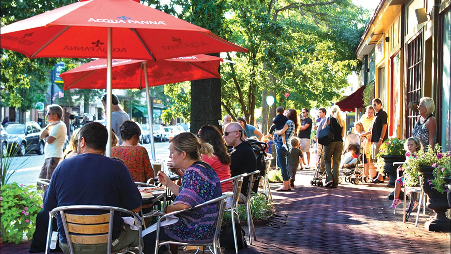
The problems was to create a funnel for people to find their own town or community, where they would be able to view the goings-on in their town and talk about it in multiple ways.
The Goal
I wanted to create a micro social network or message board where people can communicate freely, but also in a focused way for their local government.
The Process
My Role & Responsibilities
Designer – Creative, UX/UI Research & Design. Everything.
The Users
Personas / Problem statements / User journey maps
I looked over various social networks and local government sites and studied what did and didn’t work in my opinion. Local town sites were short and to the point concerning what was going on in town and I appreciated that perspective. On the other hand the local sites didn’t have any participation. The social media sites allowed participation, but it’s open-ended format causes users to get off track or lose focus on various topics.
The need to balance both is essential for this to work.
Pain Points
-
This has to be a place users can collaborate easily and clearly.
-
Users need to be given information clearly and in a timely manner. It can’t be confusing.
-
Transparency is key on a public level.
-
Users can also option to speak to other via an in-site messenger.
User Persona
DARUIS
Age: 32
Educaiton: Bachelors
Location: Haddon Twp
Personal: Married, 2 Kids
Profession: HR
“I want to stay up to date with what’s going on with my local government, but I don’t have time between a job and a family”
Goals
I want to be able to review local bills
I want to discuss these ideas
I want to know the people writing these bills
Easy to understand
Frustrations
Know this is a place of legitimacy
Easy to contact representatives
Make sure this is community based and not influenced from the outside.
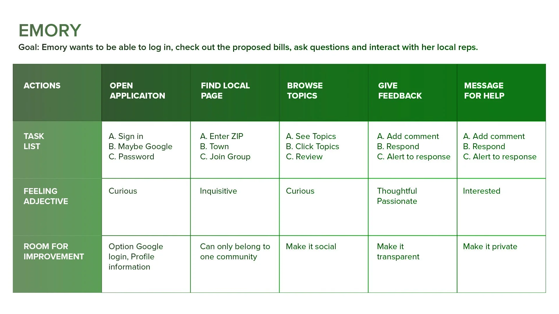
Emory is a busy person who cares about her community, but doesn’t have time to go to meetings due to a busy work schedule and raising a family. She knows everything starts locally, but for it to work, there has to be participation. She needs something that she can catch up with while on the go.
The User Journey
The Design
Wireframes / Low-fidelity Prototype / Usability Studies
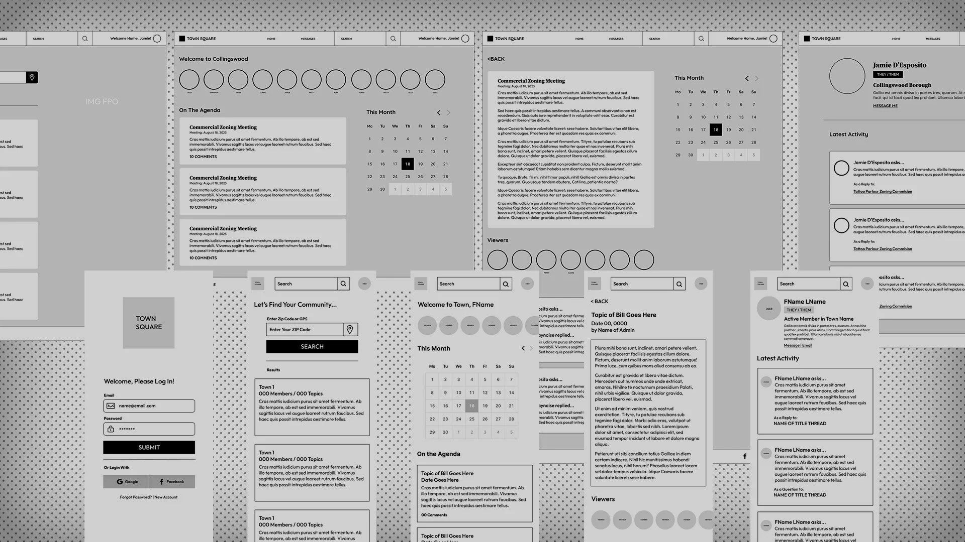
Digital Wireframes
Usability Study
Round 2 Findings
Need messaging for privacy
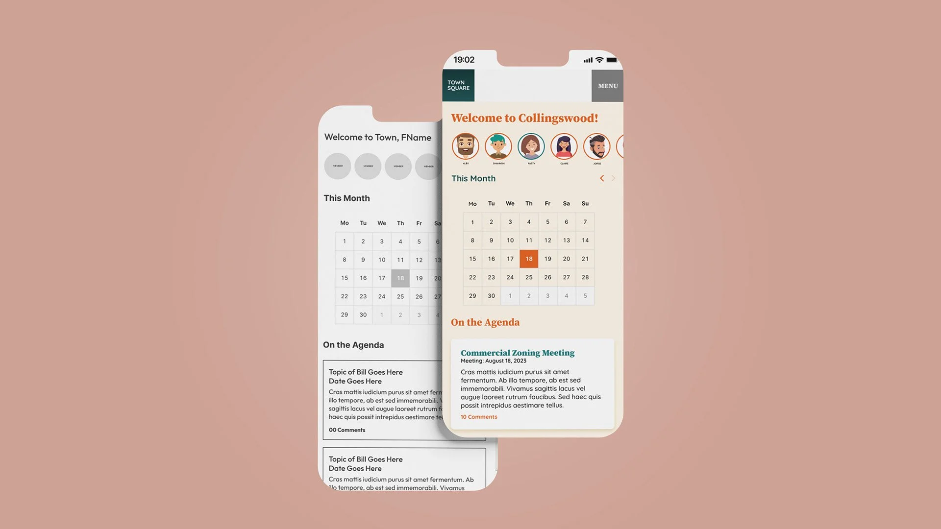
Adding a calendar for visual representation
Need profile for tracking activities
Round 1 Findings
Users want clear search options
Users needed real locations
Need comments and replies
Refining the Design
Mockups / High-fidelity prototype / Accessibility
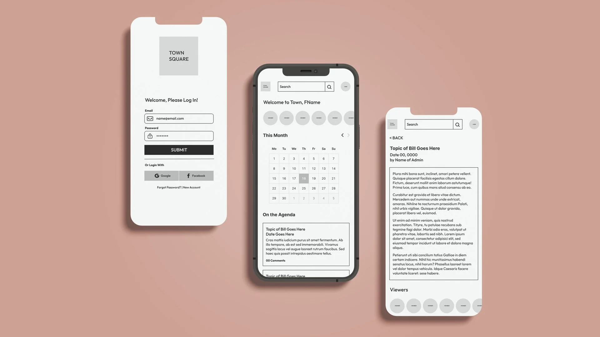
Converting to High Fidelity
High Fidelity Prototypes Mobile Web | App
Accessibility Considerations
Design with high contrast colors to lead users to major points of the site.
Use fonts that were very readable at optional to large sizes.
Use clear iconography that provides users with easy to view options.
Going Forward
Takeaways / Next Steeps
What I Learned
I learned a lot about device optionality and how each can work properly in their capacity.
Impact
I think this would be a great tool to both communicate and keep up with what’s going on locally for government, education, and just general idea sharing.
Next Steps
If you were to scale this, you could apply it to different departments or add it to sites locally. You could also work on adding admin privileges or dedicated users to moderate topics. Finally, messaging could be expanded and elaborated on.


